top of page
Product Designer


Moodboard

Wireframes & Grid
O REGIONAL
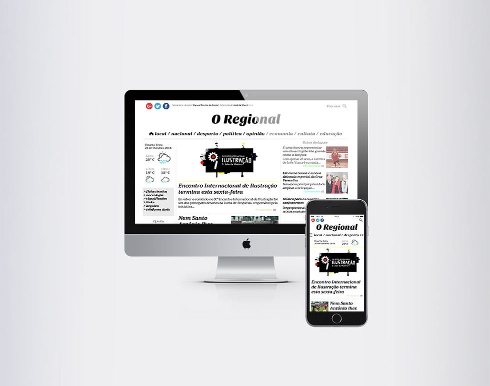
During the course of UX / UI Design at EDIT Lisboa, I was proposed to redesign the website www.oregional.pt.
Inspired by some of the best news sites worldwide, this proposal meets a clean interface, giving priority to legibility and differentiation of news categories with subtle notes of color.
Initially I chose the grid to be based on this redesign, then I sketched out some ideas and set out to build wireframes. Then choose fonts and colors and here's the final result.
Technologies used:
-
Adobe Illustrator
-
Adobe Photoshop
-
Sketch
bottom of page